Can-clusions!

Apologies for the delay everyone. Unavoidable circumstances and all…

SO here’s what you guys have been waiting for (and finally found it on other internet sites and blogs): Completed Canstruction Entries for this year:  My FAVES! The awards get announced Nov 14th so watch this space for an updated.

My FAVE for STRUCTURAL INGENUITY
Skanska, USA are working on the actual renovation of the Brooklyn Bridge right now. The team decided to build it, fully structural, just like the real bridge! Since I have a love for all bridges and all ideas that start off crazy-this one would have to be my pick for STRUCTURAL INGENUITY. (Although b/w you and me, they could have worked on making those tension cable “strings” POP a bit more visually. Right now they sort of merge into the structure from every angle that you look at it. I had to work a bit to get them to show in my pictures, but that could just mean I’m not a great photographer)

DSC_9566

Here’s the “official” pic, courtesy Canstruction/Kevin Wick.

I’m also rooting for an HONORABLE MENTION for “Alexander McCan” by KPF Architects. These guys won the GOYA sponsorship for their idea. But the manner in which they constructed this giant shoe is incredible. They used a 3 can matrix, lined them up on plans and taped them together. They use minimal supporting/layering elements AND managed to get a pattern on the front of their ginormous rendition of Alexander McQueen shoe.

Alexander McQueen inspired/KPF Architects

My FAVES for BEST of SHOW
Again SKANSKA’s bridge simply because the it is awesome. However I have a couple of other faves in close succession.

The “Loaded Dice” by Gensler and WSP Flack & Kurtz. Why? Because it is a cube so perfectly made! The slice out of the cube, represents the near perfect use of color from the labels. (At one level it reminds me of this cake by Darla, one of my favorite bakers) Of course the Gensler+WSP team is gunning for everything but I think they are a shoo-in for BEST MEAL but also might get BEST Of SHOW. Also, if there was an award for Best-Music-Played-While-Building-Can-Sculpture and Most-co-ordinated-team, they would have gotten that one as well.

Cube of colors/Gensler/

The “official” pic, courtesy Canstruction/Kevin Wick.

My FAVE for BEST USE of LABELS
The “Root Against Hunger” by Dattner Architects. Simply because it is a really great way of getting a 3D quality to your Can-sculpture and using putting labels to real good use. And their T-shirts matched their idea for their sculpture. I think they may get BEST USE of LABELS.
Tree of labels/Dattner Architects

My FAVE for JURY’s FAVORITE
I would have to say that this one is a tie between Skanska’s Bridge and Gensler+WSP’s Cube.

My FAVES for HON. MENTIONS
Actually titled “Hungry Birds”, Ennead Architects target are inspired by this populist icon of present day gaming. They wanted to build something that would appeal to adults and kids alike. I’d say they’re bang on the can!

Angry Birds/Ennead Architects

But the jury is still out on whether DeSimone Architects did a better job than Ennead.
Angry Bird/DeSimone

“Can-tanership” by Halcrow. These guys have been wanting to participate in Canstruction for many years now. Finally here, their idea is simple, elegant and reflective of what their company’s strengths are.

Container ship/Halcrow

The Converse Shoe. Loving the lace.
Converse Sneaker

Stop/Walk sign by CetraRuddy
Stop-Walk/Carter Ruddy

“Ti-canic” by Robert Silman Associates
(These folks also get the prize for Great-Sense-of-Humour while building their sculpture)
Sinking Titanic/

Live for CANSTRUCTION!

It is Canstruction time of year again. To briefly re-cap, Canstruction is the annual design competition for a good cause. In over 100 cities around the world, architecture and engineering professionals come together and build massive structures entirely of food cans!

Prizes are awarded in categories of Best Meal, Best Use of labels and Structural Ingenuity. In NYC this event is held in the World Financial Centre where the works are on display starting tomorrow Nov 10th, 2011 until Nov 21st 2011. At the end of the competition, the sculptural structures are dismantled and the cans are donated to City Harvest for distribution to those in need.

We will be blogging LIVE from Canstruction 2011 from 6pm Eastern TODAY while the teams build their structures so check out updates here.

MTA’s scuplture depicting the clock at Grand Central.
Canstruction MTA

KidSpace: Tribeca Pediatrics

Our absolute favorite places in the KidSpace series are the offices of Tribeca Pediatrics. The practice is the brainchild of Dr. Michel Cohen who follows a less intervention style of pediatrics. Although we could go on about Dr. Cohen’s warm personality, hands-on practicing style, the great doctors and care-givers at the practice and the rapidity at which Tribeca Pediatrics has multiplied, while keeping its quality intact–we wont.

This post is about the Kids. And it is about Space. It is about how a pediatricians office should look.

Tribeca Ped Waiting Room

The designers are Dr. Cohen and his wife, and artist Jeannie Weissglass. The ambience of the office, like Dr. Cohen’s approach to his medical practice, is meant to be comfortable and very approachable while maintaining high standards of client care. Taking cue from a curvy flower inspired chair that Dr. Cohen built for his first-born, the Warren Street office, the first of many, aspired to have a flowing quality.

The architectural language of custom-made curved seating, a street like space between exam rooms and a rippling moulding with spot lights all along the inside and outside of the examination rooms, successfully achieves the intent to make an organic flowing space.

Tribeca Pediatrics 3

DSC_8899

Lighting is used to differentiate areas: Soft circular lights (designed by Dr. Cohen himself) hang in playful symmetry over the children’s play/waiting area, while round globes follow the curves of the reception desks.

DSC_9165

Circular Reception Desk

The play area contains only eco-friendly toys and furniture, supplied by Rosie Hippo.

But what really sets the office apart is the vibrant vintage wallpaper that is different in each room, along with the silver circular examination tables which are again Dr. Cohen’s own design.

Exam Room

Exam Room

Exam Room

Circular Exam Tables

Wall paper in the restrooms…

Restroom Wallpapers

Restroom

The wallpaper is such a visual treat that you almost miss the port holes that have moving fishes or mirrors at kid-height in most rooms! And the kids? They love it! For them, the fun of the waiting area just continues within the examination rooms!

Porthole Fishes

By comparison, the other Tribeca Pediatrics offices have a similar design language, but the seating is always different, and custom, the colors vivid and patterns vibrant.

Custom Seating and Painting

Nurses' Station

Custom Seating

Always one for supporting the art community, Dr. Cohen works closely with his friend Pascale Ouattara to implement his designs, textured walls, wallpaper and all. And the art? Well that is also in-house. Most of the work belongs to Dr. Cohen’s wife Jeannie.

When we asked Dr. Cohen what he would like to change in the design of the offices, he would like to create a whole environment for the children where they love to come and stay. To that we say: “Dr. Cohen, it is tough enough to take the kids home right now because they have too much fun at your offices. If we had a choice we would stay back and play too…”

Space Pong

One of the really great things about New York city is the Public Space here. And one of the best things about the public space in NYC is that it can be appropriated to be anything. The streets become markets (NYC Streetfairs), the parks become theaters (Bryant Park Movies) and plazas become shanty towns that represent social discontent (Occupy Wall Street*).

Lately we witnessed the World Financial Centre become a sports arena, and an art gallery with Pongtopia. It was a public space, a sports event and an art auction all at the same time. This event was conceptualized and organized by SpinGalactic, NY’s answer to LA’s ping pong clubs, in collaboration with Brookfield Properties.

Public Space becomes tournament space
Public Pong space

Tournament
Tournament

Table Art
The Pong stops here

Kimono Pong

King Pong

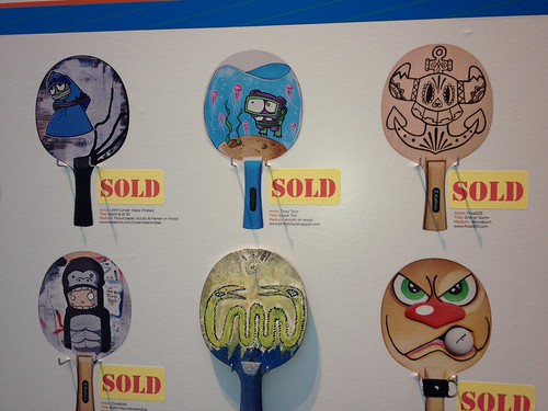
Designer Paddles Auction to benefit Operation Design
Auction 1

Auction 2

Auction 3

* More on OWS in the works

Comfy Chelsea

We met Chelsea Carle from Bethlehem PA recently. We love her interesting handmade bags and accessories! Selling under the name Comfy Cozy Chelsea, her work is for exhibition and sale at street fairs and markets in PA, but you can find her cool goods at her Etsy store here.

We love the Autumn Tote, the Vinyl Up-cycled products and her vintage Burlap/Jute collection!

Chelsea Carle
Comfy Chelsea

Colorful accessories
CC's stuff-buy on Etsy

Handmade loveliness
CC's stuff-buy on Etsy

Color me colorful

What can I say-I like color. This post is dedicated to it. I love color everywhere. That is why the Crayola Factory at Easton PA was like heaven. While I spent way too much time having fun at the factory, I did find time to take picture in the shop. I wish I lived inside those creamy crayons and smooth chalks. And as expected I came back with bags of colorful loveliness just for me.

Crayola 1

Orange these nice?
Orange these nice?

Largest Crayon Everr
Largest Crayon everrr!

These colors look good enough to eat–oh wait!–they ARE edible. (from the M&M’s store at Times Sq.)
M&Ms

M&Ms

Betty bought Butter

Some cool packaging from Yeongkeun Jeong. So intuitive, and cool. Via Yanko Design

Iron in my soul

How much of our design world is metal/iron? A quick walk through Williamsburg shows that wrought iron and the industrial look is so in. It has always been a vital part of construction, but “flaunt your metal” is the new industrial chic.

For instance, check out the Metal Dimensions workshop and showroom. The Facade is a celebration of metal (and glass), as are the pieces inside.
Metal Dimensions showroom

Sculpture or Scrap-ture?
Wrought iron sculpture

In Construction- show us what you are made of? (@ a construction site)
In construction

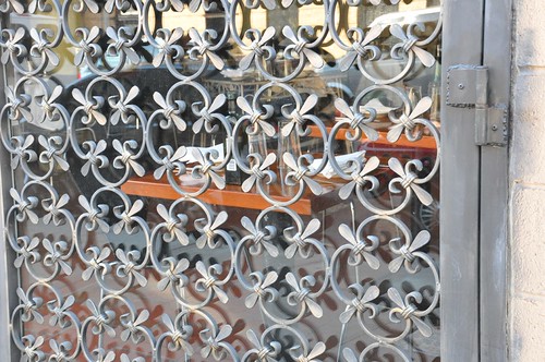
Doorway (@ Restaurant we passed by)
Entry doorway grill

Peace and Pieces (@ Mandala Emporium)
Peaceful Metal

Brace yourselves (@ Mandala Emporium)
Metal Bracelets

My Mekko

November 1st marked the first month of Marimekko’s flagship store in New York City. Now before we go any further you should know that Marimekko’s products, especially their very recognizable UNIKKO patterned products have retailed through Crate and Barrel’s M shop for quite a while. But this is their first company owned store in NYC and we hope that they will stay…!

The design of the store space, as the brand, is very unique. Stylish and simple but with vivid splashes of color, it is a visual delight to negotiate the store. The high ceiling helps by adding space. The displays are modern and tasteful.

We love the cube entrance! Note how the glassware forms a nice visual passage.
DSC_9139

Elegant dresses in a fluid display.
DSC_9138

The children’s area has vibrant colors and lots of space.
DSC_9135

The layering of open shelves adds lightness to room but maintains visual continuity through the store.
DSC_9130

The tall fabric storage racks highlight the space and the space highlights the fabrics.
DSC_9127

They know their work is loved.
DSC_9122

The array of products includes clothing-some very typical styles and cuts, crockery, bags, kids stuff and of course their fabrics. The Flagship store will also start in-house custom sowing soon. Keep tabs on their website for further details!

Taxi 07: Nissan’s New York

Being one of the authors of the Taxi:Roads Forward book has its privileges! We were invited to preview the features of the Nissan’s Taxi of Tomorrow before it opens to the public on Nov 2nd at 23rd street in New York.

Taxi of Tomorrow

The Yellow Taxi is as much an identity of New York as the Empire State Building. It is a way of life, a mode of transport. It is a public space, a movable space, that forms the backdrop of many private interactions 24/7 in the life of this great city.

The Taxi of Tomorrow attempts to be many things. Nissan’s Francois Farion, Senior Manager, Design & Color Strategy, very enthusiastically explained Nissan’s vision for this new avatar. Consulting heavily with the Taxi and Limousine Commission and deriving from the research and benchmarking done by our “Taxi Book“, the Taxi of Tomorrow attempts to be many things that the present cab is not.

Sneak peek at interior panel
Ket features include:

  • Higher roof and much more leg room;
  • Special design of the wheel to take the number of miles that these vehicles travels;
  • An integrated console that has the HVAC built into it and includes a 15″ monitor in place of the small screen you see now;
  • Seats made of fabric engineered to have no VOC;
  • Active carbon to make the cabin smell and feel fresher;
  • Factory installed bullet proof partition which can slide, to speak with the driver and designed to provide maximum views of NYC;
  • Curtain air bags ( in order to be effective, you must be strapped in though);
  • High boot to accomodate maximum storage;
  • And our favorite: A polycarbonate roof to make the Taxi lighter, and to provide views of the skyline as you drive past!
  • Partition

It is not all good though. This Taxi, as its predecessor, is not ADA compliant, although we are told that it presents itself to customization in order to become so. Plans are to lower the floor to provide wheelchair access into the vehicle. In addition there is little or no provision of a built in child harness/car seat. Considering how many urban families use Taxis as their main form of transport–that is an area where this Taxi of Tomorrow could have really made a difference.

Tributes to the Taxi of Tomorrow

Still, it tries and does quite well in most other aspects!

Check out our signature on the graffiti wall at the exhibit.

We were there...